What happens when a system designed for hundreds is forced to support one million?
Background
Submittable delivers software-as-a-service connecting grantmakers with grantseekers to support their shared mission of driving social impact. Submittable’s platform has roots in helping authors get their work into the hands of publishers, who then review and either accept or decline the author’s work. This experience was built upon the assumption that publishers would have a handful of users working with a few hundred submissions from authors.
The problem
As Submittable’s business has grown, so has the scale and number of organizations it works with. This growth has put pressure on a system that was designed to handle hundreds of items, not hundreds of thousands.
Challenges caused by high volume and usage
- Unexpected and inconsistent behavior in the software due to significant load and fragile infrastructure
- Customer Support being inundated with complaints
- Customer workflows break down when trying to work with tens of thousands of items
Impact on the business
- Larger organizations are more significantly impacted by scale issues and many high value accounts are at risk for churn
- Inhibits Submittable’s ability to sell into high volume markets or approach enterprise organizations
My role
As a Senior Product Designer, I was tasked with gaining a better understanding of the problems our customers were experiencing and distilling this information into actionable goals for both product and engineering teams to execute against.
The approach
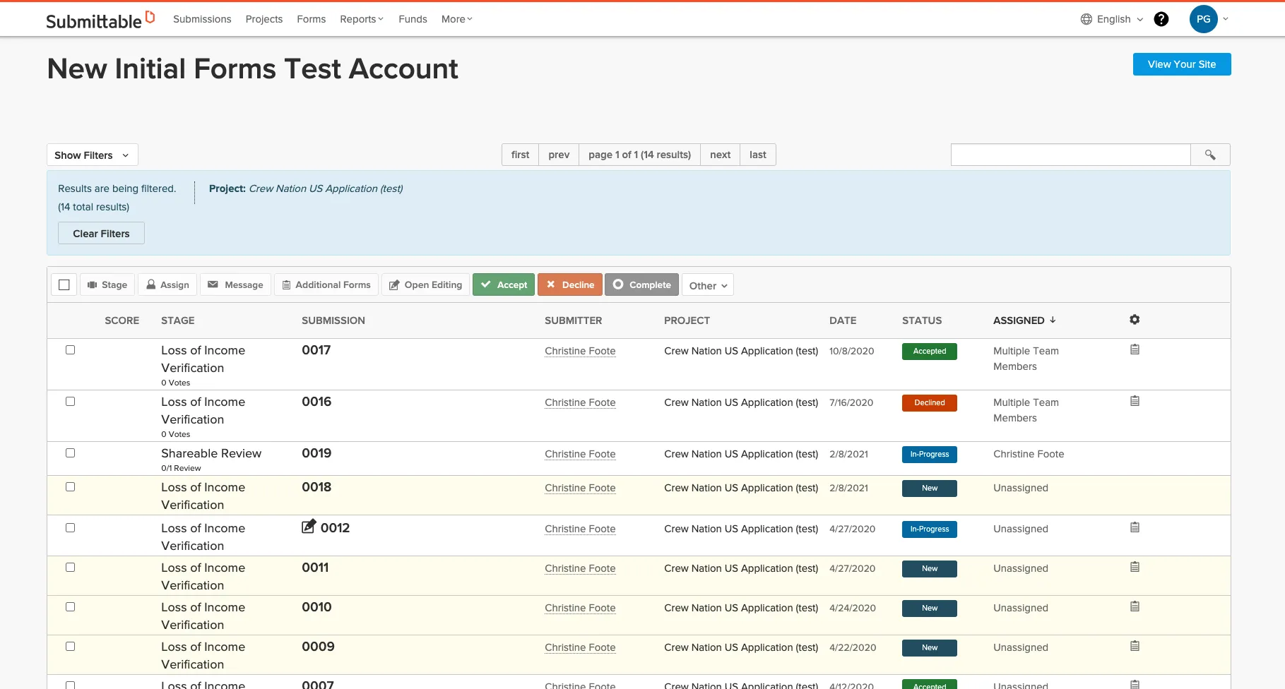
I focused my efforts on the core experience of Submittable’s product, internally known as the "Submission List View". This is where administrators view and manage all submissions received and where reviewers see what they need to do next. The primary goals for this view are to find the submissions I’m looking for and to take action on them.
The Submission List View is one of the earliest experiences that was developed at Submittable. As the product has grown, this view has seen many changes and adaptations to accommodate new features. These changes have been made without taking a holistic approach to updating the core technologies and experiences that drive the Submission List View.
Engineering was advocating for a re-architecting of the technologies to handle the scale and growth of usage. The Product Team was advocating for a re-design of the experience to align features with user goals in a more intuitive way.
Discovery: Find the why
Submittable was already feeling the pain of these scale issues, so I wanted to move quickly with lean research activities. I started by conducting internal stakeholder interviews with three customer support representatives and two onboarding and implementation specialists. These folks were immediately accessible and work directly with customers on a daily basis to understand and resolve pain points.
To gain a deeper understanding of what the Submission List View was capable of, I documented all possible actions a user could take within the view. This introduced me to features and experiences I didn’t even know existed and gave me insight into how grouping actions could simplify the way users discover and act on the things they see.
Research findings
After synthesizing all of my interview notes and reviewing my actions audit of the existing Submission List View, I was able to identify actionable UX themes that I could run with.
- A list of all submissions ever received is overwhelming
- Almost always, users are looking at submissions for a single project
- Taking action on a large number of submissions is nearly impossible, especially keeping track of what I have already done
- Different audiences need different tools to accomplish their goals
- Finding important information for submissions is complicated and not easily accessed
- Don’t assume we know what all customers want to see
- Filtering capabilities are lacking and aren't discoverable
- Assigning reviewers takes a long time and is very tedious
Through my stakeholder interviews I was able to identify and document three primary personas that use the Submission List View in different ways and need different tools to accomplish their goals.
I took these user goals and mapped them to high level user flow diagrams for each persona to better understand how they move through the product to accomplish their goals.
The vision
Build a flexible framework to help users find success faster and adapt to customer scale.
With a better understanding of the people and how they spend their time in the Submission List View, I translated my UX themes into actionable product initiatives:
- Introduce a simple hierarchy centered around a project to provide high level status and a focused ingress point to view relevant submissions.
- Transform the filter experience to be more discoverable and intuitive to help administrators and reviewers find the things they are looking for faster.
- Enhance the submission list table to be customizable, allowing customers see data that’s most important so they can make decisions faster.
- Organize and simplify the way a user takes action on one or many submissions to move their processes forward with efficiency.
Next, I needed to clarify the architecture of the Submission List View to support the identified user goals. Using the list of possible user actions that was generated from my actions audit, I conducted a card sorting exercise to group all of the items into themes and arranged those themes into a logical flow.
I then translated this flow into a simple information architecture describing the goals and flow of the experience. I chose to focus on the administrator experience, as it is the most complex and also the most impactful for all of Submittable’s customers.
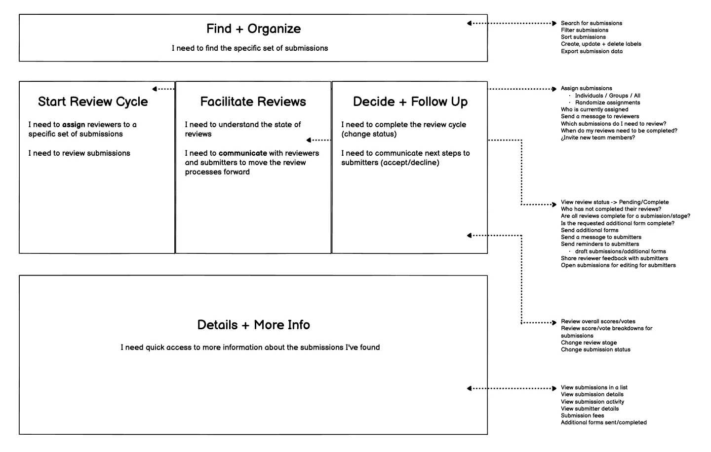
The Submission List View was suffering from density and a lack of organization and intent for the available actions a user could take. After more clearly understanding the architecture, I was able to move forward with iterative wireframes exploring possible content structures. I shared these wireframes with engineering leadership and tested the designs with another group of customer support representatives. The technical feedback from engineering and insights from my usability tests drove this iterative process.
To promote simplicity, I grouped relevant actions together and consolidated them into a panel experience that users could expand when they are ready to take action and hide when they need more real estate for data. Making highly used filters immediately actionable allows customers to discover filter options without having to hunt for them.
The reality
After sharing the wireframes with my engineering partners, I received feedback that the technical feasibility of making any significant changes to the Submission List View was not possible at this time without significant refactoring and investment. Balancing this feedback with our business goals of relieveing customer pain in the near term, I was faced with the question of "What can we do in the next six weeks that will carry the most impact and value for our customers?" .
My recommendation was to pivot focus to another key experience that I identified as part of my initial research, the "Projects View". Engineering confirmed that the Projects View was much less complex and contained less technical debt, so enhancing this experience was feasible in the timeframe we were working with.
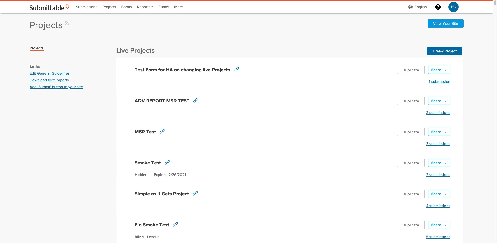
In Submittable, Projects are a collection of submissions that have been received from a single specific form. The Projects View allows users to manage their forms, understand how many submissions have been received and see how submission reviews are progressing.
Elevating the Projects View to an actionable dashboard
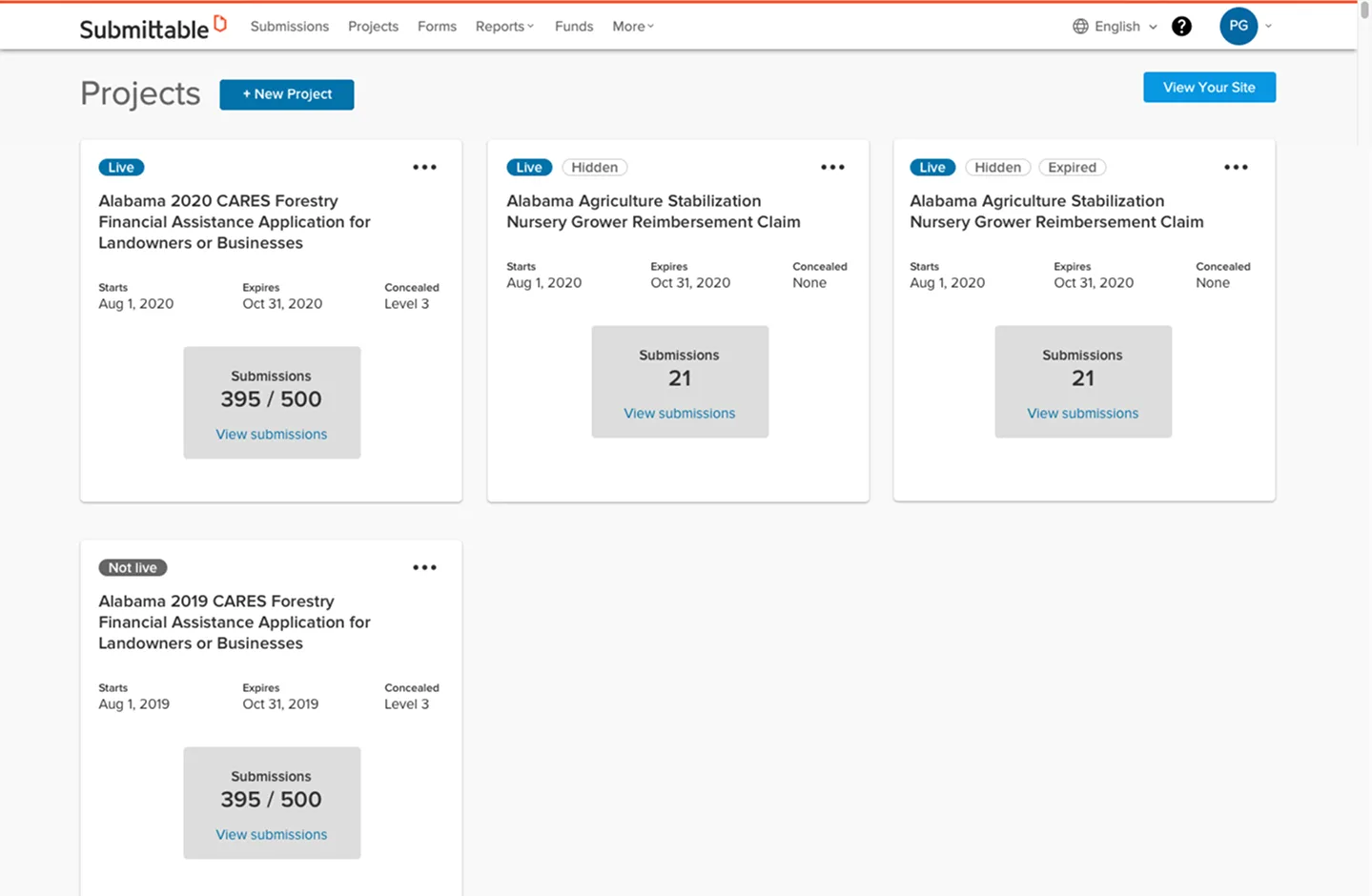
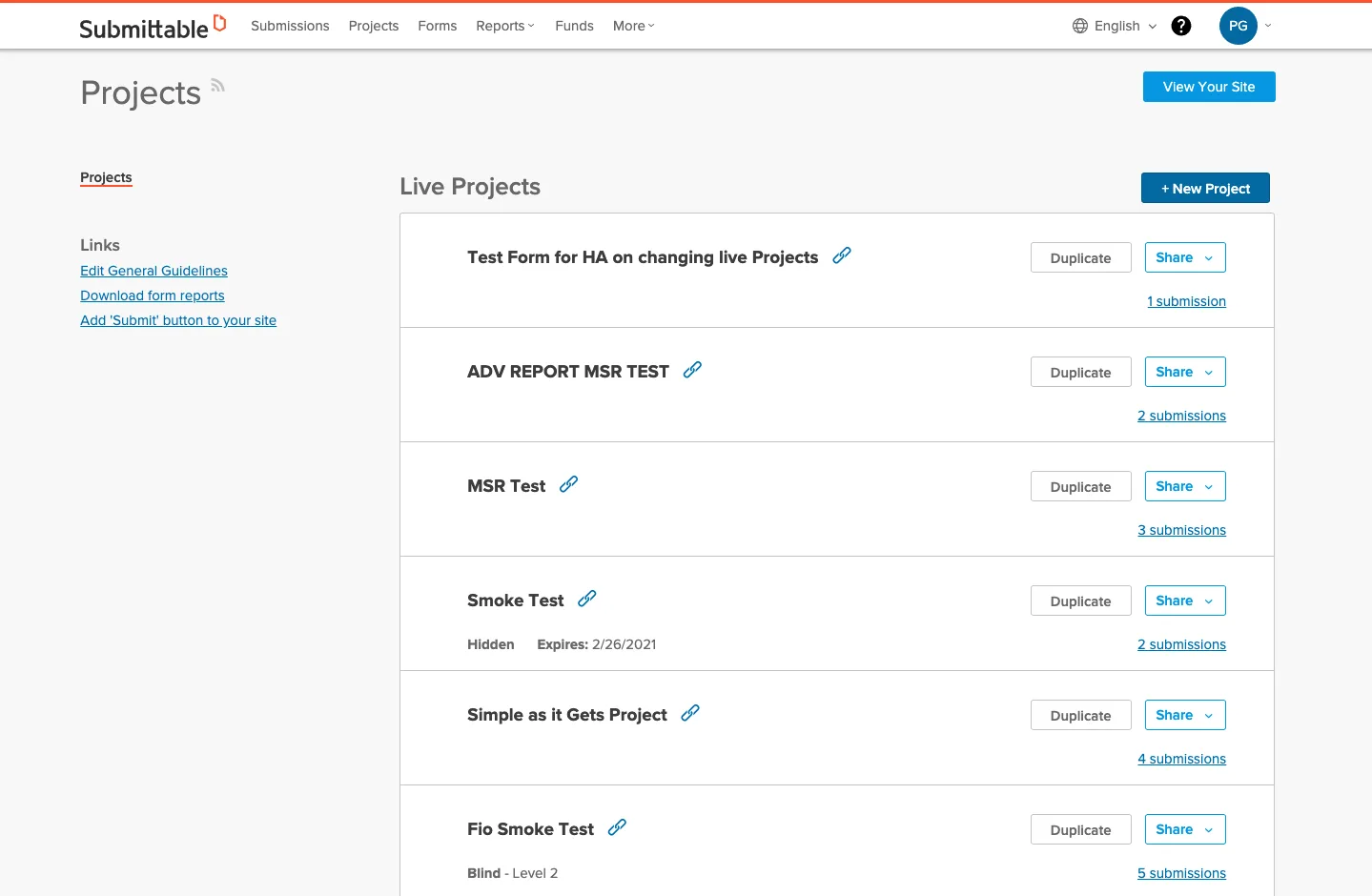
The existing Projects View is a long list of all the projects an organization has created and lacked any sense of liveliness or action. It felt like more like a grocery list of items instead of a place to get a holistic sense of how my projects are going. I proposed a new card style layout to better accomodate high level metrics that our customers care about, like how reviews are progressing and the number of submissions received over time.
Validating assumptions with data
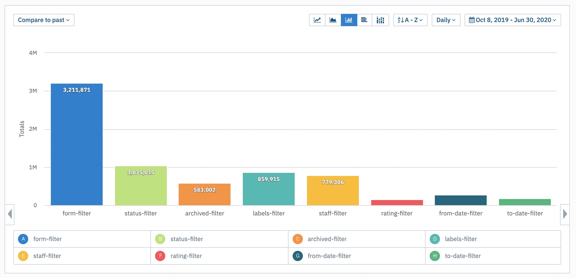
Digging a little deeper, I wanted to validate a few assumptions I was working with by referencing product usage data collected with Amplitude. I was specifically interested in understanding whether or not customers needed to view submissions for more than one Project at a time. The data supported what I had heard in customer calls and my own assumptions after testing the product. When a user lands on the submission list view, almost always, they apply a “form filter” to only show submissions for a single Project at a time.
Another area of concern with moving to a card layout was scale. How many active projects are customers working with? Seeing with more than a handful active projects could get overwhelming when trying to find a project you care about. So, I reached out to our data analyst to better understand how customers use projects today. The data showed that over 90% of organizations have less than 10 active projects at a time. To make sure the data I was looking at wasn't an anomoly, I asked our data analyst to add weekly data to understand the usage pattern over time.
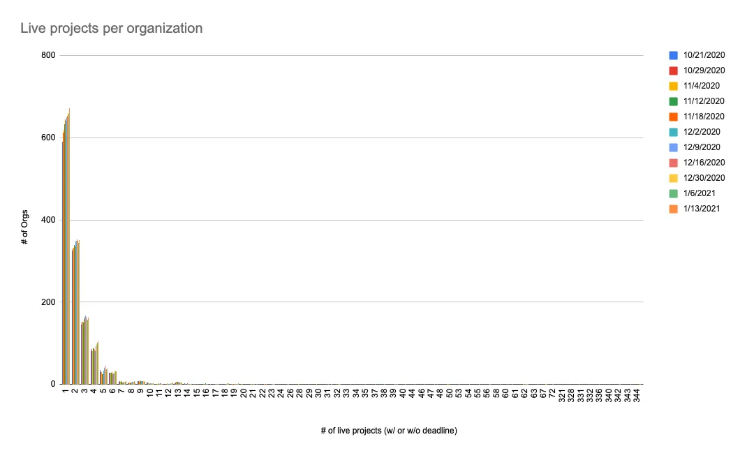
These learnings gave me confidence in my decisions to promote the Projects View to the primary landing view after a user signs in, rather than the overwhelming Submission List View.
Gain momentum with iteration
I worked with senior leadership and engineering to prioritize the Projects View enhancements as the first product initiative to be executed in a series of initiatives and enhancements. As part of this effort, we chose to simplify the scope of work to only include existing data and not introduce any new features for the first iteration. It’s more important to see progress and gain momentum than deliver sub-par experiences that don't add value.
Transformation from list to dashboard